As the Lead UX Architect for Ford Credit's Digital Marketing Department I was responsible for leading the UX Design across the entire Ford Credit Digital Marketing portfolio.
On this product specifically I paired with the team's Product Manager as they had been filling the UX Role for the team before I joined and had much insight and knowledge.
We worked collaboratively with the Development Team, Product Owner, and Stakeholders in Management to assure that solutions met Ford Credit's larger goals.
Discover
Discovering the Drop-Off
Shortly after joining the team a Product Manager in the department noted that there was a high drop off in the completions of the online credit application (OCA). As Ford Credit's primary business model was the servicing of leases and loans, the OCA was the primary method most new users entered the Ford Credit ecosystem.
The three leading hypotheses for the cause of the drop off were:
1. Poor user experience leading to people starting the app and abandoning it out of frustration. 2. Dealers forcing users to re-complete applications at the dealership even though they were previously approved. 3. Launch of a new integrated system coincided with the drop-off that changed how leads were sent to Dealers causing differences in the tagging, which could have been causing false negatives in abandonment.
Personas
Some details altered to protect the innocent.
Dealer Dan (Ford Dealer)
Ford Dealer who just wants to sell cars. Doesn't care about the OCA, just wants to sell cars.
Millenial Melanie
American first time Ford buyer fresh out of college who expects an easy intuitive experience. May not have great credit. Is shopping around.
Canadian Melanie
American Melanie's twin sister who's a lawyer - only cares that everything is legal and localized for Canada.
Lindsay the Returning Customer
Returning customer who has bought a Ford before and has a great credit score which makes her a good candidate for automatic approval. May have previously interacted with the OCA at a dealer.
Larry the Lincoln Dealer
Lincoln Dealer who wants to remove all of the burden from the purchaser. Aims for an 'effortless' buying experience of luxury vehicles.
Define
It Wasn't Bad Data
One of the leading hypotheses was that the launch of a new middle man system broke tagging, causing a spike in abandonments that wasn't accurate.
We reached out to a data analyst to confirm that the tags were working, and in the end determined that the increase in abandonments to the OCA was legitimate.
It Was Bad UX
User testing verified that the form was hard to use and many people would start it, especially on Mobile, only to abandon it and come back to it later on Desktop. Only to abandon it again and fill it out at the Dealership. One user could cause three or more failures in the system.
While there does exist a system for the Dealers to pull approved Credit Applications out of the system they prefer not to use it because it is cumbersome.
Why 6 Times
Our research with users showed that by the time they were filling out the Credit Application they had either already chosen a vehicle, or were trying to find out exactly how much financing they would be approved for to pick from a selection; or choose a model.
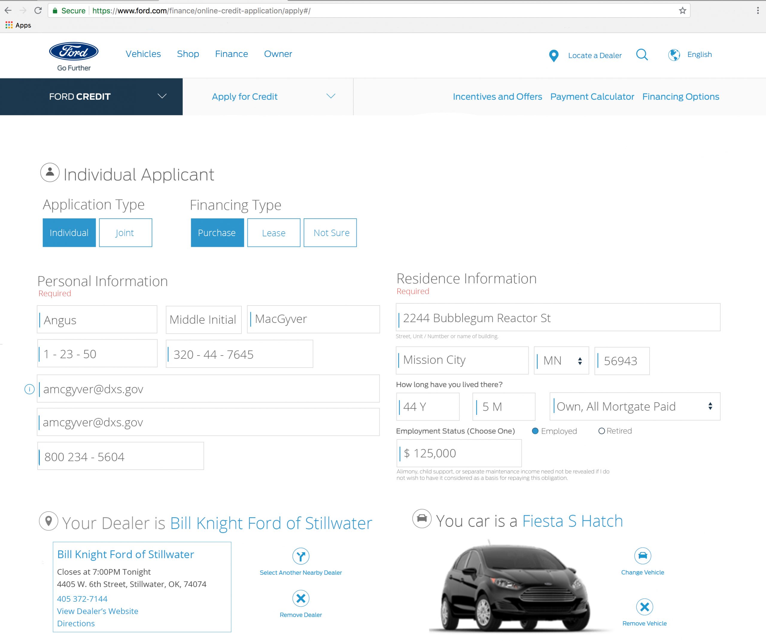
When copying the existing screens into Photoshop, I noticed that when expanded all of the accordions full of white space made the page approximately 10x longer.
Mobile was an entirely different UI developed against separate comps, with almost all of the same issues as Desktop, just with different screen elements and a faux-wizard that let users move on to the next screen with errors, which only became apparent when they clicked complete 5 screen later.
Asterisks were used for non-required fields, causing confusion.
Terms and conditions had checkboxes off-screen.
Forced 60 second wait time to complete the form, even though the back-end was finished in 10 seconds.
Design
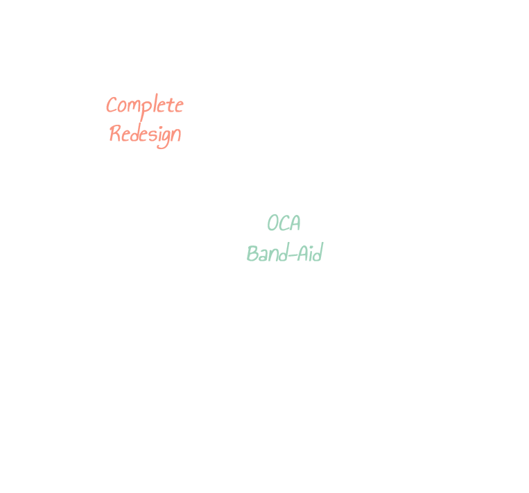
Solution 1 - Quick Band-aid
- Take existing screens and UI elements and streamline them - Remove all accordions - Remove optional fields - Low development effort - Quicker to market than complete rewrite - Reduce white space - Elevate error messages - Form field validation on de-focus
Solution 2 - Redesign & Wizardify
- Wizardify experience to reduce confusion - Guide user through step by step - Streamline experience - Would require complete rewrite, large development effort - Better UX than a Band-Aid - Adds new functionality like drivers license scanning to pre-fill sections
One of the core goals of the Band-Aid fix was to meet Legal requirements as well as alleviating end user pain points. In something as legally challenging as a Credit Application each individual element, line of copy, and button must be approved by Ford's legal team.
One of the main benefits of re-using existing elements and providing a design that was a rehash of existing elements is that would limit the impact to the business as a whole because the elements had previously been approved.
Design for Developers
I was able to utilize my knowledge as a Front End Developer to minimize development effort. I designed the Band-aid fix to primarily utilize CSS changes, and require no back-end changes.
I worked closely with the Product Manager and Development team to understand the product and limit designs to things that were easily implemented.
Impactful Changes for Melanie and Lindsay
Reduction of whitespace led to a 90% reduction in page size making it easier for the users to navigate the form.
Removal of a forced 60 second wait time for approval allowing users to receive their decision in a more timely manner.
Consistent desktop and mobile experience by moving to to a responsive design.
Clarified CTAs and touch points to reduce confusion on how to progress through the application.
Simplified vehicle and dealer selection process to allow customers to more quickly complete the application.
ask orion about me!
Orion is based on a mistral model and is trained on my portfolio and resume – he runs locally and isn’t ChatGPT!